Thursday, 31 March 2011

Is moving away from product page standards a good tactic?

I have invested a huge amount of time and tests on our website's product pages in order to optimise it to maximise usability and conversion. However in reality, these pages look very similar to many other product pages. Product image with a buy button to the right, followed by product description, reviews etc. underneath. This is mainly because these are the online standards and crucially, what users expect. It's the same reason why car designers don't move the brake to the right hand side.

I was surprised then to see that Uniqlo.co.uk, the hugely successful fashion retailor, had moved its product pages away from this standard. This is an example of their product page:


The navigation from item price through colour and size selections is intuitive and nicely structured. The add to shopping bag area (it's not a button!) is greyed out, which turns black and becomes active when colour, size and quantity has been selected. 


This is a nice idea; does it work though? The progression down through the options to the add to bag button is natural but being placed far down the screen, and not even looking like a button, is a move quite far away from the web standard. 

I'm very much in favour of innovation and not following norms for norms sake, however websites have moved to standards for a reason - usability. When designing and optimising websites, the questions we have to answer are: what do users know and expect and and what do they need to know? It would be interesting to run behavioural tests on this product page to see how users navigate and find the add to bag button. 

One of the most influential tests that has informed website design revealed the f-shaped pattern for reading web content. Through eye tracking software, this research found that users read web pages in the shape of the letter F. Two horizontal stripes, followed by a vertical stripe:


The middle image above is a product page from an ecommerce website. The red box in the top right hand corner is the add to cart button. If you placed this F pattern over the Uniqlo product page, the chances are that users would miss the add to bag button.

To take the F-shape behaviour further, my own research suggests that users expect to scroll down through a product page in the F-shape and then back up before adding to cart. This is all part of the user's product research and decision making process. To then have to look for the add to cart button or scroll back down the page, like Uniqlo makes you do, isn't particularly usable. This is why add to cart buttons are almost always at the top of the product page.

When you do click add to cart, you stay on the page with a message at the top of the screen that it's in the bag. From here, there's no checkout button, just a link to your bag, which isn't highlighted. Again, there's optimisation work for Uniqlo here that could improve its conversion.


I don't know what Uniqlo's website conversion is like, so it's difficult to make judgements, however my recommendation would be to revisit its product pages and add to cart button, include a checkout button and revert back to standards - they're called standards for a reason.

Thursday, 17 March 2011

Dynamic logo design

Following on from my post about why I like the London 2012 Olympics logo, I read this article about the new MIT Media Lab's brilliant logo design. It outlines why the new design is so clever, and a large part of this is down to its dynamism.

The London Olympics logo has the same concept in mind and this is the reason why I like it so much. It can easily change and adapt while maintaining brand identity, with MIT having different variations of its logo in mind for different people in its lab. Check out the designs below and what FastCodeDesign.com says about dynamism:

“dynamism” is a embryonic concept in identity design nowadays, with a few brave souls like Comedy Central and the Southeastern Center for Contemporary Art testing the waters. See it at the Media Lab, though, and you know it’s the future.


Monday, 14 March 2011

What can online learn from Hollister stores?

In a previous post, I wrote about three things high street stores could learn from ecommerce websites. What I didn't explain was that in the early days, online borrowed heavily from the stores and I think there are things that websites can still learn from them.

One store that sticks out in my mind above others is Hollister, the US fashion brand from the same people that brought us Abercrombie & Fitch.

I first came across Hollister when I saw a queue outside their shop in the Westfield Centre in Shepherds Bush, London. The only queues I had ever seen outside any shop were at the Next January sale, Waterstones on the night one of the new Harry Potter books was published and HMV when Ocean Colour Scene did an in-store signing. How I wish it was 1995 again. I couldn't believe people (young people) would queue up outside a store when there was no sale or special guests signing CDs.

I had the opportunity to visit a Hollister store recently, without queueing, so I went in to understand what the fuss was all about. I was immediately greeted by his 'n' her models, him wearing nothing but shorts and her wearing a bikini. Bearing in mind this was February in New York and -9 outside, and you'll begin to appreciate what type of brand experience Hollister stores create. Not surprisingly, Hollister is aimed at teenagers as a laid-back Californian surf and beach lifestyle brand. Their stores are reminiscent of a surf shack and take on a casual and reasonably informal vibe.

Inside, the store was pretty dark and I became engulfed by a sweet smell, which was pumped throughout the two levels I visited. Everyone that worked in the store appeared to be the most attractive person in New York City. Behind my wife of course. And me. I walked past pretty girl after handsome guy and each one, clad in Hollister branded clothing, smiled and asked me how I was doing.

In the store are lounge chairs that don't match and large green plants that bring the outside in. The store itself felt quite cramped with low ceilings and not much space in the aisles. This meant that regardless of how many people were in there, it always looked busy. 

It's clear that the company has put a huge amount of thought into creating a unique experience for its customers. A visit to Hollister certainly is an experience and I can now appreciate why people want to wear the brand and queue up outside its stores. 

So what can online learn from Hollister?

Hollister has created a level of exclusivity for the company. You're not just buying a t-shirt, you are buying into that exclusive club. Making customers queue up and operating a one-in-one-out policy furthers the exclusivity and interest and makes for a wonderful, free marketing tactic.

How many people walk past a queue without asking what the people are queuing for? I did when I first walked past the Hollister queue. Many shops use January sales queues as a PR opportunity, building it up as an event in itself. Next and Harrods do this every year. Hollister has taken this once-in-a-year opportunity and turned it into a once-every-Saturday event.

In many ways, some websites have used this concept and translated it for the web. Voyage Prive and Cocosa are examples of websites that only allow registered members to view their deals and offers, which are time limited. In truth, its quite easy to register on these sites for free, however not only does this give these new websites an instant opportunity to build a database of e-mail addresses, it generates this feeling of exclusivity.

Can other ecommerce stores translate this feeling of exclusivity elsewhere? Frequent flyer schemes have managed to do this by offering membership benefits that aren't afforded to people outside of the club. Membership sections and benefits for repeat customers can easily become a part of a website's strategy to begin creating this feeling of exclusivity.

The experience that Hollister creates in its stores is difficult to simulate online, however not impossible.

The online industry has invested a huge amount of resources researching how visitors interact with websites. This has made them easier to use and much more intuitive. This means we've got largely standardised ecommerce sites so that visitors know exactly what to do once they first arrive. Nothing is left to chance.

What this means is that little thought is given to creating something memorable and unique for the people who come to visit. Think about the last time you visited an ecommerce website and came away with these feelings? There is an opportunity to translate Hollister's in-store experience online and deliver something memorable for visitors and this has to be a challenge for brands. 

I'm currently working for Veynd, an activewear and casual clothing company, and our store has been built as a memorable brand experience. It offers a standard ecommerce journey - think home page, PLP, PDP, but it translates the branding and uses a visual palette that allows us to stand out from our competitors in a way that Hollister once did.

Wednesday, 9 March 2011

Why I like the 2012 London Olympics logo


Among all the euphoria that flowed from winning the right and honour of hosting the 2012 Olympic Games, it was the one thing that brought the country crashing down to earth with a bump.

Launched in June 2007 and designed by Wolff Olins at a cost of £400,000, the logo was greeted with derision and embarrassment from press and public alike. The recent claims by the head of Iran's National Olympic Committee that the logo spells out the word 'Zion' and was therefore a subtle, pro-Israel emblem, has provided further criticism and pushed it firmly back into the spotlight.

After launch, the general consensus was that the logo was nothing more than art school standard, lacking any real imagination or flair. When put into context with previous Olympics logos, the design is very different and goes against the standard. Neon colours, white Olympic rings and no emblem to associate the games with the host country. It's no surprise then that the recently launched Rio 2016 logo is a return to form.


However amidst all the criticism, I am going to stand up for the logo. I like it.

I think it's a very clever design that has achieved its brief, which was to create a different and exciting logo that reaches out to young people, defines London as a city, Great Britain as a country and the Olympic Committee as an Organisation.

Perhaps this emphasis on youth was the instigator for the media backlash and in some ways is affirming the success of the design. However, successful branding should appeal to more than one demographic. Even more so for an Olympic Games that the British Public is ostensibly paying for.

One of the main reasons why I like it is its versatility. From a purely marketing point of view, it has enabled the Games' partners, like EDF Energy and Lloyds TSB, to use it with their own branding, while retaining its identity as the Olympic logo.


There aren't many brands that can achieve this and certainly the designs from Sydney, Athens, Beijing and Rio would find it difficult to incorporate sponsor's branding. I can almost sense the collective sighs at the thought of me backing multinationals highjacking an amateur sports event's logo to boost their profile. Is there nothing left that's sacred?

The reality is that sponsorship is a necessity for staging global events. The London 2012 Organising Committee will receive an estimated 40% of its operating budget from this sponsorship. This reduces the pressure on the Government's resources and provides opportunities for the Committee to claw back some of the costs of running the Games.

What's also important with the logo is that it has got people talking; a huge amount of column inches have been dedicated to it, providing it with the perfect launch. Everyone knows what it looks like and everyone has an opinion on it. And that's what's important.

It has instantly provided the London Olympics with a recognisable symbol and something to associate with the Games. If we're being honest, how many of us remembered any of the previous logos for the Olympic Games? I don't even remember the logo for South African Football World Cup and that was barely six months ago. I'll remember the 2012 Olympics logo for some time to come.

I actually think that if people are questioned about the logo again, almost four years after it was first revealed, most opinions will have softened. Time is a great healer. Coupled with this, the Iranian ire has enabled the British public to do what it does best; stand up for itself in the face of adversity. These comments have switched focus from attacking our own to supporting it and with the games a little over 500 days away, this will only amplify as excitement builds. 

Tuesday, 8 March 2011

3 things high street stores can learn from their online cousins

In a previous post, I wrote about how bookstores are closing down and that competition from online and supermarkets had squeezed the market. It's not just bookstores that are closing down either. Across Britain, town centre vacancy rates rose to 14.5% at the end of 2010, up almost 10% on 2008. There are myriad reasons for this, including businesses running on credit for too long and a store rental system that massively favours landlords; however one factor that has resulted in a permanent cultural shift, is the move to buying online.

Britain leads the way when it comes to ecommerce in Europe, with online representing 10% of UK total sales. So what can high street stores learn from online? I've listed three ideas below that could be adopted by physical stores and whereas they won't alter any shift to online they should improve the customer experience and the shop's chances of survival.

Tell me what I want, what I really, really want
One of the things that online does really well is that it offers you the personal touch. Most stores know who returning customers are and what they've bought before and so they tailor content and related products that best suit their interests and tastes. This enables online to effortlessly up-sell and cross-sell, tempting us to buy more.

Online we're individuals and we're treated to a personal and highly enriched experience. However as soon as you walk through the front door of a shop you're just a face in the crowd, presented with the same static products that everyone else sees. But that needn't be the case.

Stores will strategically place products in aisles or sections of the shop that they know sell well together. The tea is generally in the same aisle as the biscuits, for example. However I don't think they go far enough.

How many times have you gone to buy some shoes in a department store and been presented with suggestions for jeans or a handbag that will go well with them? Small flat-screen TVs with footage of models wearing clothes or accessories that go well with the items I'm looking at would encourage me to shop further. How many times have you picked up some flour at a supermarket and next to it seen a leaflet for a kick-ass cake recipe that demands you buy eggs, sugar, chocolate etc.? Not many in my experience and these are all lost opportunities.

Capturing customer data
Cos, the exceptional older brother (with a higher disposable income of H&M) is the only shop I have been in that has asked me for my e-mail address. As I waited for the store assistant to bag up my extremely tasteful shirt, I wrote my name and e-mail address on a card. It took me less than a minute. They now send me regular updates and special offers, including invites to events where they launch sale items to people on their list before the general public.

Why don't all stores do this?

They do! What about the Nectar card and Boots Advantage card?

Okay, so maybe the trend of storing customer data started offline, however in my experience it's not caught on. Other than the sign up at Cos and the leaflets for loyalty cards, I have not come across one example of a store asking me for data so that they can keep in touch.

I would also push for the supermarkets and even Boots to simplify their sign up, lock you in quickly and easily in-store and then hit you online for more information. At home and online is the point where you have more time and are happy to fill out an application form. It would also be less labour intensive as systems would capture your data, rather than requiring people to input it into a system.

Dynamic changes
Ecommerce is continuing to grow thanks in part to its dynamism and ability to make changes on the fly. Data can be analysed and changes made on the same day with results monitored to understand their effect. This has resulted in new products and different ways of presenting them, new ways of paying and the ability to implement offers and promotions at the click of a mouse. Physical stores can't be as dynamic. But why?

Shops often work to seasons and plan in advance for promotions and sales. In-store advertising and displays are difficult to change and managers have to maintain consistency across different stores. So what can be dynamic in a shop? I think it comes down to people.

Store assistants are the most intelligent and flexible resources available to managers and they can be empowered to act and behave in a more dynamic way. This happens to some extent in stores that have salespeople working on a commission basis. They can give away a percentage of their commission in order to secure a sale. Would this work across all stores? Maybe managers can create promotions or discounts that they pass down to store assistants who can then give them out to customers at their own discretion, rather than advertising them widely?

There are many other things that I've not included here but also many things that online can learn from high street stores. I think the thing to always hold in mind is that although different, on and offline strategies can be interchangeable and consistency among the two is paramount.

Tuesday, 1 March 2011

The modernisation of publishing and the challenges it brings

This week it was announced that Borders is preparing to go into administration, which comes all too soon after the HMV group announced a number of Waterstones branches would be closing. The now familiar story of online competition and increased sales at supermarkets have squeezed the retail market and this time, the bookstore is the fall guy.

Not long before Borders' announcement, The Bookseller reported that the e-reader market doubled over Christmas 2010 and that quite astonishingly, 13% of British adults now own an eBook reading device.

The growth of the mainstream eBook market took off at the same time and shows no signs of stopping. Amazon sells more eBooks than print, as does our very own PacktPub.com, with our 2010 digital sales up 33% on the previous year. The launch of the iPad and Amazon's aggressive marketing and pricing strategy of its Kindle gave e-reader adoption the kind of kickstart few earlier adopters had the power to achieve.

It's relatively easy to re-read the above paragraph and for every mention of e-reader and eBook substitute iPod and and music download. For Amazon use iTunes. The two stories are very similar. Back in 2006, US music downloads had increased by 77% on the previous year, while Apple sold 88 iPods a minute.

What the publishing industry is going through currently, the music industry has already experienced and this shift to electronic and death of the bookstore is evidence of the modernisation of publishing.

Surely great news for publishers?

Unfortunately for the music industry the digital revolution hasn't all been great. CD sales continue to plummet and aren't being propped up by download sales. Writing in The Guardian, Dan Sabbagh notes that while music is thriving, the industry itself is dying and makes the following observation:

"It has been a decade since piracy and the arrival of iTunes – which destroyed the notion of an album in favour of single, downloadable tracks – but the music business has found nothing to repair lost CD sales." 

This one sentence neatly sums up a key problem in the industry and how the introduction of digital changed the way that we consumed music. Luckily for publishing, breaking up a book and selling it chapter-by-chapter isn't as viable. Despite this the move to electronic book delivery presents publishing with other challenges.

Universal eBook pricing
Amazon has set the price for the majority of its eBooks at $9.99, a move many publishers were unhappy with. Amazon relented, however this price point has stuck and Apple are now using it as a standard on its iBookstore. Whereas this may make sense for your top ten bestseller list it doesn't take into account the specialised books from the independent publishers, who price up the cost based on fewer sales expectations and the niche element of the market.

Self publishing cutting out the publisher
Not a week goes by without the story of an author making it as a self-publisher. In fact, I only read this morning on the always excellent Econsultancy.com of the threat to publishers that amateur authors pose. The article references Alice Hocking and her success with self-publishing. I felt compelled to comment and note that for every Amanda Hocking there's a million and one self-published authors with under 100 sales to their name. Self-publishing website Lulu.com would probably back this up.

In reality, the majority of these self-published success stories have had a profile and fan base before going it alone. Hocking may be an exception to this. When Radiohead self-released In Rainbows in 2007 people said it would open up amateurs bands and musicians to bypassing record labels and breaking the charts. As amateurs have no existing fan base and no means to reach the masses, this hasn't happened.

It's also easy to underestimate the other services that publishers provide; it's not just about getting a book to market and exploiting contacts. Whereas most authors can take on marketing, it's the professional editing, proofreading, layout and other production services that would be beyond most, especially those without prior publishing experience.

Delivering multi-platform content
First there was slate, then paper, then muuuuch later eBook, then browser, then app - what next? Wikipedia suggests that there are 18 different eBook formats! There are so many ways to consume content now that it's difficult for some publishers to stay relevant. Staying ahead of the adoption curve and delivering content to demand is a serious challenge for publishers. eBook formats will narrow with two or three becoming dominant, however the innovations with consuming content will continue.

Piracy
The music industry knows all about this. So does Hollywood. As eBook adoption grows, so will piracy and this is something that all publishers are nervous about. It's actually affecting us now with torrents full and links regularly showing up in search results. There are companies developing software to combat the pirates who are serving the eBooks and seeding the links. Publishers need to work closer with these companies to help develop and refine the software; this is a common problem and should be tackled by the industry together.

Developing a direct sales model
Whether through subscription or consumers buying individual copies from their website, this is the holy grail for publishers. Bypassing bookstores and Amazon enables publishers to talk to the people who are buying their books and ultimately, get them to buy more. The problems is that this isn't something publishers have prioritised in the past.

However eBooks present a new opportunity.

There is no printing and shipping, which makes logistics and set up easier and cheaper. Through their website, fulfillment can be immediate with the publisher catching customer data. More importantly publishers aren't giving up a percentage of sales to a third party retailer. With bookstores closing and sales moving online, now is the perfect time for publishers to start doing it themselves.

Despite the demise of the bookstore this is an exciting time for publishing and the opportunities for publishers

Thursday, 17 February 2011

Business brands for 24/7 workers

24/7 is a dream of efficiency for businesses.
Buying and consuming all day across the world.
Working across each timezone.

You probably work more than 9-5. And you probably check your email at night; at the weekend; again; and again. But that's ok. Because businesses do run all night, and because you might well have your best brainwave at night, or in the shower. And now you can capture it, and act on it, straight away.

We've got the technology to be more connected, and we can make the trade-offs in how we use it.

The acceptance of business as innate to our lives, rather than a prop for them, is changing our habits of consumption. e.g. Business products required in the home - e.g. broadband is often a domestic necessity to keep us online (witness those MP's expenses for it), e.g. Social products required in business - e.g. iPhones and iPads used for corporate email. Both products keep us working and playing all day long. Symbiotically we're connected in technology, but also in thought and focus on priorities of what we must do.

Business brands are having to move further away from the stereo-type "Business Man" to people who live and work in the same life. Accenture focused on marketing through Tiger Woods, to move Consulting to a favourite ground for mixing work and play. Cisco have demonstrated the benefits of their technology to people, more than just technology offices to create the 'Human Network'.

Opportunity to succeed comes from being able to demonstrate benefits to users, that reflect life of ambitions that inter-relate work as well as what we do outside it. Brands who can benefit our quality of life, and our success to manage colleagues, managers, friends and family will succeed in the complex web we've woven.

This is a guest blog, written by Phil Edelin, Brand Consultant for Dave.

Wednesday, 16 February 2011

Is Big Brother a good concept to base a marketing campaign on?

The concept of Big Brother rarely gets treated with a positive spin. From the television programme to CCTV cameras, the term is awash with negative subtext. People don’t like the thought that they’re being watched, controlled, or left powerless by others. So with this in mind, why would a company design a direct marketing campaign based on the concept of Big Brother?

There are a number of increasingly popular tactics that companies are using that retarget consumers who have visited their site without buying anything. This is called behavioural retargeting. Or behavioral retargeting if you're on the other side of the pond!

For Christmas 2009, I bought my wife some clothes from Oli.co.uk. Later on in the year, my wife was using my laptop and visited the same website. The next time I checked my e-mails there was one from Oli:


I was confused because I'd not visited that site since the previous Christmas. I assumed it was spam. After establishing that my wife had been on the site that week, I understood that the the company had employed retargeting tactics using information from the cookie in my browser. This is a creative marketing strategy. However, I hadn't given Oli permission to contact me in the first place so to receive an e-mail thanking me for visiting a site I hadn't personally accessed was an invasion of privacy. Oli will argue that this e-mail is permissible because they're contacting me for the same reasons that we had originally done business. This is okay without opt-in.

I understand the strategy behind it, however I wasn't impressed and it left me with a poor impression of the company. I talked to my wife about this and her first reaction was of shock that a. Oli had the capability of doing this and b. they thought it was an acceptable tactic. Oli.co.uk has since merged with Freemans.com, so it will be interesting to see whether their retargeting tactics change.  

This is an example of behavioural retargeting based on my previous interactions with the company. Companies are also using behavioural retargeting even when they don't know who you are. 

You can visit a website, search for or view certain products and the site's cookie will then intelligently seed adverts through networks with the same or similar products, encouraging you to come back and convert into a customer. Therefore, if you visit a website that's part of the network, you'll be served with adverts that present you with similar products. 

I'm going to Nice later this year, so I'm looking for hotels. After visiting Expedia, I left without booking because I wanted to check out the prices of the same hotels on other sites. Today, I visited a non-travel related website and was presented with the ad to the right with details of three of the hotels I was looking at a few days previously. Clever.

Again, this could be regarded as invasion of privacy, however I'm not as shocked about this as Oli's retargeting. Why?

Sure, Expedia is hitting websites I visit with records of my previous searches, however I don't feel like it's invading my privacy. It's not pushing its way into my letterbox and telling me that it's spying on my every move. These ads are taking a more subtle approach and although it's a reminder that my online activity isn't private, it doesn't feel invasive.

I asked my wife what she thought about this retargeting technique and her instinctive reaction was that it was clever. After some thought, she then started questioning how it worked and exactly what information was being shared with third parties. She ended up having so many questions that her initial enthusiasm was forgotten. 

This is still relatively early days for this type of tactic. While retargeting is one of the more advanced ways of improving conversion, it needs some refining and I think it will improve as consumers' awareness of it grows. 

If you look at the bottom right hand corner of the ad above, there is a small i symbol. When clicked, this gives you more information about how the ad works and also an opportunity for you to opt-out of behavioural retargeting. This is good because transparency is important; however I wonder how many people actually click it? I'm guessing the number is very low! It's pretty inconspicuous. 

So how can this awareness and transparency grow? Should websites carrying these adverts have some responsibility for explaining to its users why they're being served targeted ads, or is it the advertisers responsibility? Should consumers have to opt-in to this advertising instead of having to opt-out? I think in the case of Oli.co.uk, opt-in should be a given.

Thursday, 3 February 2011

Amazon’s personalization feature should be more personal

Amazon is an ecommerce trailblazer. From the long tail strategy that Jeff Bezos adopted for the company to its groundbreaking affiliate scheme. Where this online giant leads, others follow, including Packt.

Amazon was one of the first websites to introduce personalization and the ability to push targeted products to customers based on their browsing and purchase history. This transformed the customer experience and gave us products and options that we weren’t aware of and ultimately persuaded us to buy more.

I like French films but my French isn’t great, so I rely on reviews and recommendations from English speakers. With Amazon’s personalization, I get a regular stream of suggestions and ideas of films to watch. However I think Amazon’s personalization algorithm is flawed and needs updating.

My main gripe is that it doesn’t take into account fast-moving, regular purchases against one-off or once-in-a-while items. Before expanding into the world's biggest department store, Amazon's core business was books, CDs and DVDs. Personalised recommendations of these reasonably low-priced items work well and I have bought many a French film thanks to them. However if I bought a new LCD TV, I don’t expect to be presented with a list of other LCD TVs every time I visit the site over the next few weeks.

Amazon also heavily weights its personalization results with your most recent activity. So if I was to visit any page on its website, even if someone sent me a link to a product with funny reviews, my next session would be dominated by similar products. One of the reasons I included this here was because I had been sent a link to the reviews of an album by a questionable celebrity duo and for my next visit, I was presented with the male half of the duo's back-catalogue. This has happened with other products.

However on researching this blog, I found a link to an article about funny Amazon reviews. I checked out this relaxation tank on their .com site, with some very funny customer comments. I then visited the homepage to see what I was presented with, expecting other relaxation-based products and instead, there was a list of the other items with funny reviews. Maybe Amazon has cottoned on, with its .com site leading the way.


Over Christmas, I used Amazon to buy many of my presents, as many of us did, however even though I was happy to buy my sister a copy of the Style Book: Fashionable Inspirations, I didn’t want to see similar products the next time I visited. I want to see suggestions of similar products that I'm interested in, not those that I've bought for others. My sister may disagree.

With Amazon, you can delete items from your browsing history, however for an intelligent system, I shouldn't have go out of my way to visit my browsing history and then scroll down to delete the things I wasn't interested in seeing. They could make this easier for customers by offering checkboxes on product pages and in the checkout procedure. Even if there was an option for me to state whether the purchase is a present and if I wanted to remove it from my browsing history, would be a good start.

Amazon, with all its customer data and purchase history, should also understand what products are bought regularly and those that we buy less frequently. These products should be removed from the personalization adverts, or at the very least, show me one or two products, not a never ending list. For what has been designed as an intelligent system, it hasn't scaled its intelligence as the site has scaled.

Wednesday, 2 February 2011

The single most popular shopping cart conversion clincher

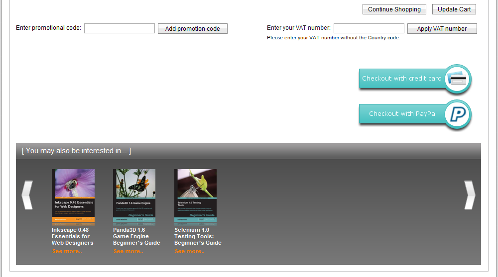
The conversion and abandonment rates of our shopping cart are two of our most important ecommerce KPIs. The shopping cart has been optimised to within an inch of its life, following best practice and tips from industry leaders.

This has resulted in:
  • A standout checkout button with available card symbols and a trust seal placed above the fold
  • Checkbox for easily copying over shipping to billing address
  • Product availability 
  • Breakdown of price
  • Upsell to related products
  • Shipping costs
In early 2011 we're adding premium shipping options and a save cart for later button.

Am I missing anything here to help optimize our checkout further? Let me know what you think.


These improvements improved conversion and subsequently our abandonment from the cart dropped. However, there was still room for improvement. So where was this extra juice to be squeezed from? The only concrete way to find out was to turn to our customers. I've mentioned in another post how talking to our customers is probably the most important and successful tactic we employ for improving our services and this is another example of that.

We began e-mailing and surveying customers that dropped out of the cart to ask them why and also wrote to those that converted to ask them what swayed them. 

The number one reason? Shipping.

Due to the location of our printers and distributors, Packt offers free shipping to certain countries and charges for others. For those with free shipping it was a deal breaker, for those that we charged shipping for, it was the number one reason for abandoning. For many customers, the shipping costs put doubts in their minds about the overall cost and was a push to find the same product cheaper elsewhere.

This was difficult to counteract as it would result in changing our business model or heavily reducing our profits. So what was left for us to do? How could we turn these customers around? 

The answer was with our eBooks. For all print book orders, we added the upsell message for our eBooks and outlined how these offered quicker access. This didn't reduce the price of shipping but offered a relatively cheap way to start reading the book as soon as it had been purchased. Of all the optimisations we introduced on the site, this was the most effective in terms of reducing abandonment. 

So sometimes, you can follow as many best practice guides as you like, however in order to find out how to take your site's performance to the next level, the answer is with your customers.