H&M, one of Europe's leading high street fashion brands, launched an update to its website today, a little over six months after going live with its first ecommerce site. Today's launch is hardly a surprise. Their opening attempt at entering the world of online retailing was largely a disappointment with the site unintuitive and difficult to navigate, with a poor checkout system and featuring only a small number of products. So what's changed?
Gone is a homepage that made you click to enter the ecommerce store and in its place is extensive product navigation and quick links to view various items and collections. They have packed in three levels of navigation at the top of the page, which, despite looking a bit cluttered, gives quick access and a route to more frequently asked questions.

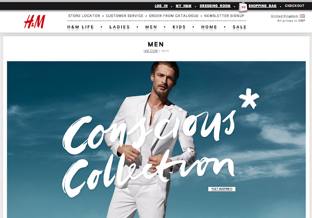
Category pages, linked from the main navigation, aren't much different to the homepage, only showing products specific to that category. The huge image that takes up the whole of the screen is advertising one of H&M's collections, however it's missing an opportunity to offer variety and showcase all of their products above the fold.


Gone is a homepage that made you click to enter the ecommerce store and in its place is extensive product navigation and quick links to view various items and collections. They have packed in three levels of navigation at the top of the page, which, despite looking a bit cluttered, gives quick access and a route to more frequently asked questions.

Category pages, linked from the main navigation, aren't much different to the homepage, only showing products specific to that category. The huge image that takes up the whole of the screen is advertising one of H&M's collections, however it's missing an opportunity to offer variety and showcase all of their products above the fold.

Product categories are a major improvement. There are more products to select from than were available on the first version of the site, which is an important step forward. Products are clearly displayed and organised with secondary image on mouse-over, pricing and colour options for each product. These lead through to specific product pages, instead of in a pop-up window, which the old site inexplicably featured. Having said that, the pop-up is still available through a quick shop link on products.
Images, sizing, detail, pricing etc. is nicely laid out, all above the fold, and the add to cart button, despite being light grey with dark grey text (that turns black when you have selected a size), is well placed, though I would definitely A/B test its design. The absence of delivery information and shipping prices remains a disappointment.
What I like most about the updated site is a new Dressing Room feature. This enables users to virtually try on combinations of clothes to see how they look together and then easily add the selected items to their cart. This is simple, effective and fun. I'm surprised they're not pushing this more on the site - the link to Try On is underneath the main image on the product page and on the top navigation - why not ditch that huge image on product pages (as above) and push the idea there instead?

It may be my connection, however the site feels a little slow still. When you click add to cart, it takes a few seconds before your shopping bag is updated, keeping you on the same page rather than directing you to the cart. When you click to checkout, the process has been slimmed down and instead of having poorly chosen related products, I'm offered more looks that show me various other items that go with the trousers that are in my cart. This is a major improvement.
The size of the text in the checkout is pretty small and there's no option to increase its size. Perhaps this is a nod to the age of the average H&M customer... Despite my eyesight, I managed to change the colour, size and quantity of the product all from the cart, rather than having to go back to the product page, which is a neat feature, just wish they'd make it a bit bigger, my mouse pointer almost covers the drop-down box!

Checking out is quicker and now you're not presented with silly cart upsells, which was a poor feature of the original site. Entering credit card details is now on a separate page and doesn't offer users with opportunities to navigate away. Weirdly, the 'Valid To' date is called 'Valid Through' on this page, which confused me a bit and possibly a translation error that wasn't picked up in testing.
H&M's first ecommerce website was something of a car crash and it would be difficult to make things worse. Fortunately for them, this is a much improved offering and the speed with which they launched version two is impressive. As well as fixing some of the poor navigation, product listings and checkout, some of the added features are a real step forward and represents the brand online as it is perceived offline - contemporary and up-to-date.
Take a look for yourselves: www.hm.com
No comments:
Post a Comment